People drive cars all the time. We drive it from our house to our work (or to school), then back to the house again. It’s an innovative necessity that helps anyone get from point A to point B in the least amount of time and in the most comfortable way possible.
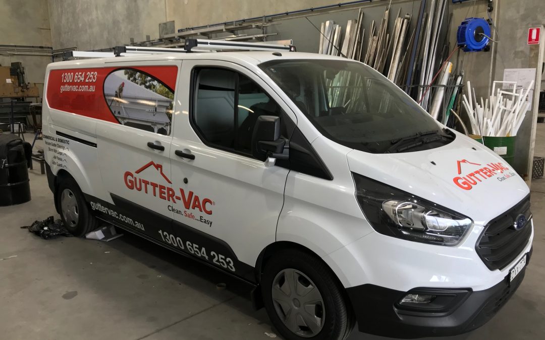
But today, vehicles aren’t just being utilised for travel and transportation. There are a lot of businesses, nowadays, that use them for marketing via vehicle signage. However, this type of approach often falls flat on its face due to a single culprit: not having (and applying) best practices.
Why are Best Practices Vital?
Best practices are the set of professional or commercial procedures that are proven to be the most efficient methods. It is recommended to businesses, corporation, organisations, and so on, and those that apply them discover how helpful they are. However, those that have little (to not having) best practices will eventually, and unfortunately, end up in bankruptcy.
One of the main reasons why best practices are so efficient is because they resolve an issue at its core. For example, a team is having issues with communication, making it difficult for everyone to be on the same page. Regular meetings (a brilliant best practice for a group) ensure that everyone is up to speed with their tasks and priorities and that everyone’s voices are heard.
Best Practices for Vehicle Signage
Vehicle signage contractors have some best practices of their own too, and here at Signs Australia, we follow the ones that make us capable of giving the best results to our valued customers. Here are some of them:
- Oversize Image and Readable Lettering – One of the most basic rule when working on vehicle signs is that an oversize image is a surefire head-turner. People can’t help but look at huge images, allowing the signage to garner lots of attention. Readable lettering is also very important because this lets onlookers read the contact number, address, and call-to-action.
- Minimal and Outlined Texts – Most of the time, people who’re going to see the signage will only have less than 3 seconds to process the information on it. It’s best to keep text minimal but to have them outlined, so they stand-out from the design. What we like to do here at Signs Australia is add yellow with black strokes as the outline (if possible), since they’re the strokes that stand out most.
- Putting in a Call-to-Action – It’s possible to have best-looking brand, logo, or image incorporated in the signage, but without a call-to-action, it won’t amount to much. The call-to-action allows a person to feed their initial interest by pursuing it. Common call-to-actions for vehicle signage are QR codes, website address, and a phone number.
Any opportunity for marketing is of importance to any business, and we understand that which is why we aim to provide our customers with the best vehicle signage by following best practices, applying them, and making sure that the signage is top quality. Why do we do this? Because here at Signs Australia, we make sure your signs get all the attention!


